Bleusalt
Summary
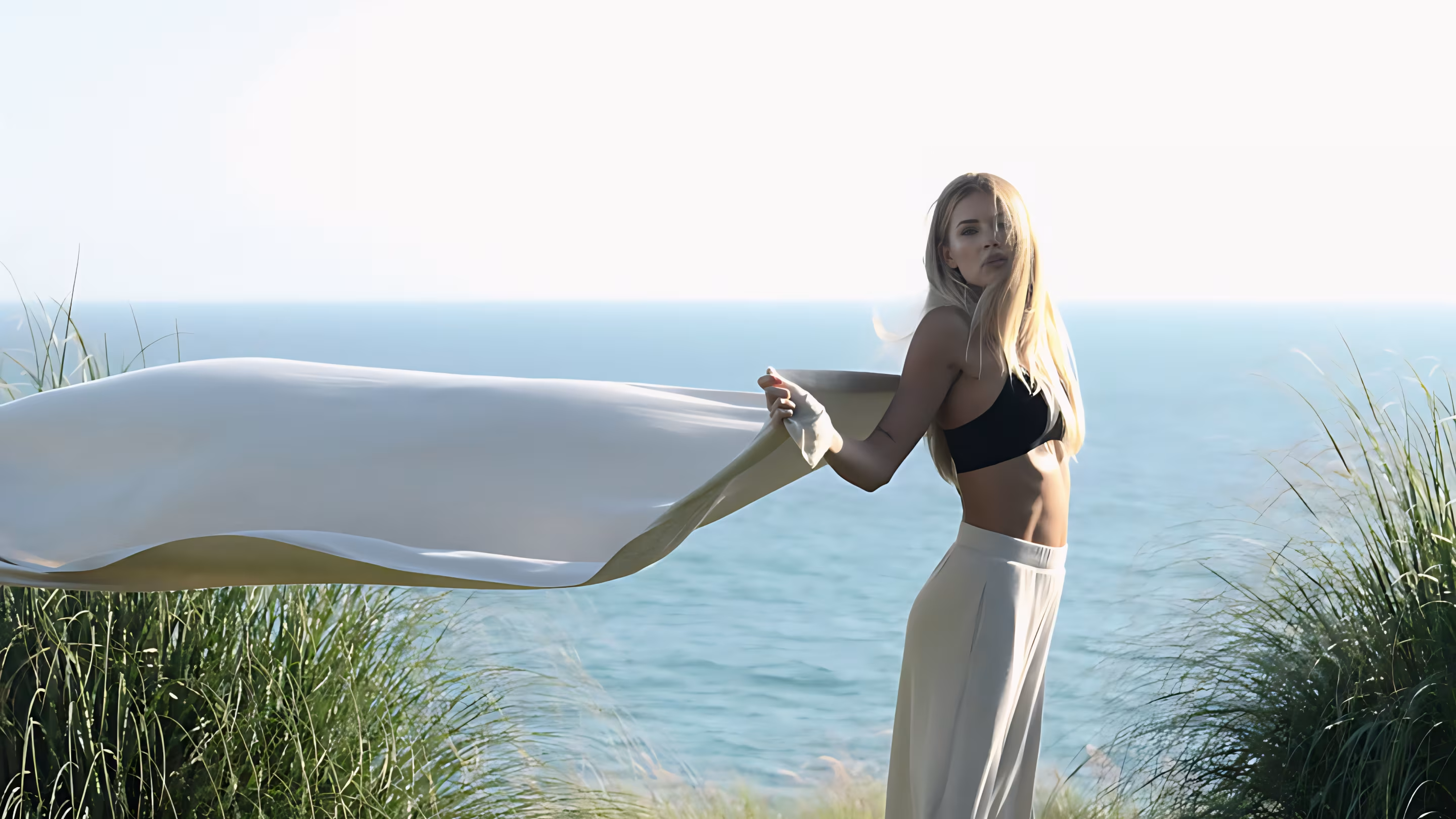
Bleusalt creates seasonless luxury essentials from premium fibers. I designed the e-commerce experience across web and mobile — homepage, product pages, and app flows with the editorial restraint the brand photography demands.
Editorial brand, generic storefrontDirect link
Premium fashion lives on photography — but the storefront was fighting the imagery with cramped layouts, cluttered product pages, and a mobile experience that felt bolted onto a desktop template. Bleusalt had the visual identity. The UI hadn’t caught up.
Over several months I worked through customer research, brand workshops, and journey mapping across discovery, product detail, and checkout. The brand felt considered everywhere except the interface — purchase columns buried under copy, mobile shoppers pinching through desktop grids, and no clear thread from browse to bag in the app.
What kept surfacing: people decide on imagery and options first, details second. Navigation needed to feel editorial, not e-commerce boilerplate. The hypothesis that emerged was that luxury converts when the interface gets out of the way and lets the product breathe.
“The checkout is the last chapter, not the cover.”
Every UX and visual decision followed from that. I structured the homepage, product detail layout, mobile navigation, and cart flows around generous whitespace, clear purchase columns, and thumb-reach patterns — editorial first, commerce second.

Editorial first, commerce secondDirect link
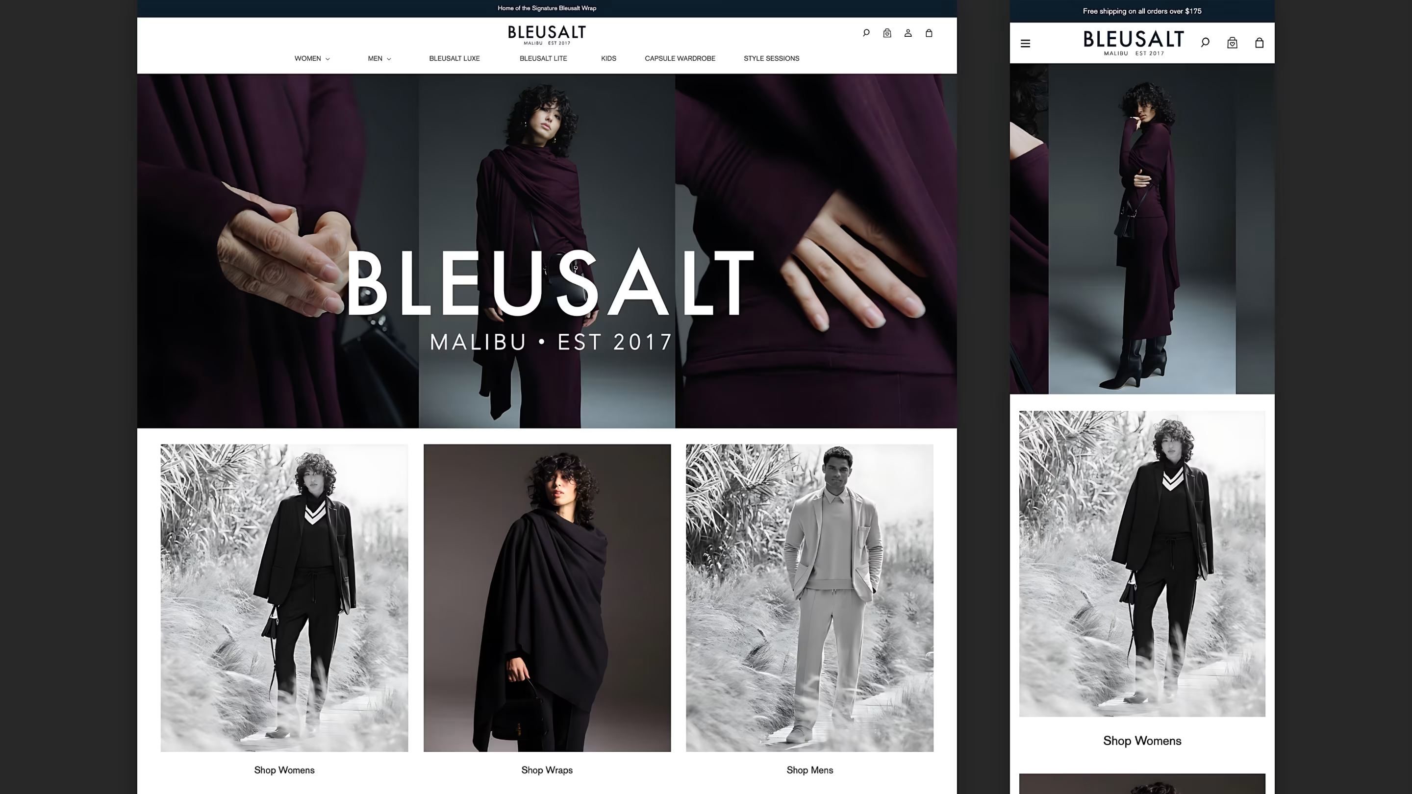
The homepage had to feel like a lookbook, not a catalog dump. On desktop I used a three-panel hero montage with category entry points below — Women, Wraps, Men — and a nav that surfaces Capsule Wardrobe and Style Sessions without crowding the header. Mobile collapses to a single hero image and stacked categories, with a persistent shipping banner and icon-only utility actions.
Product detail with room to breatheDirect link
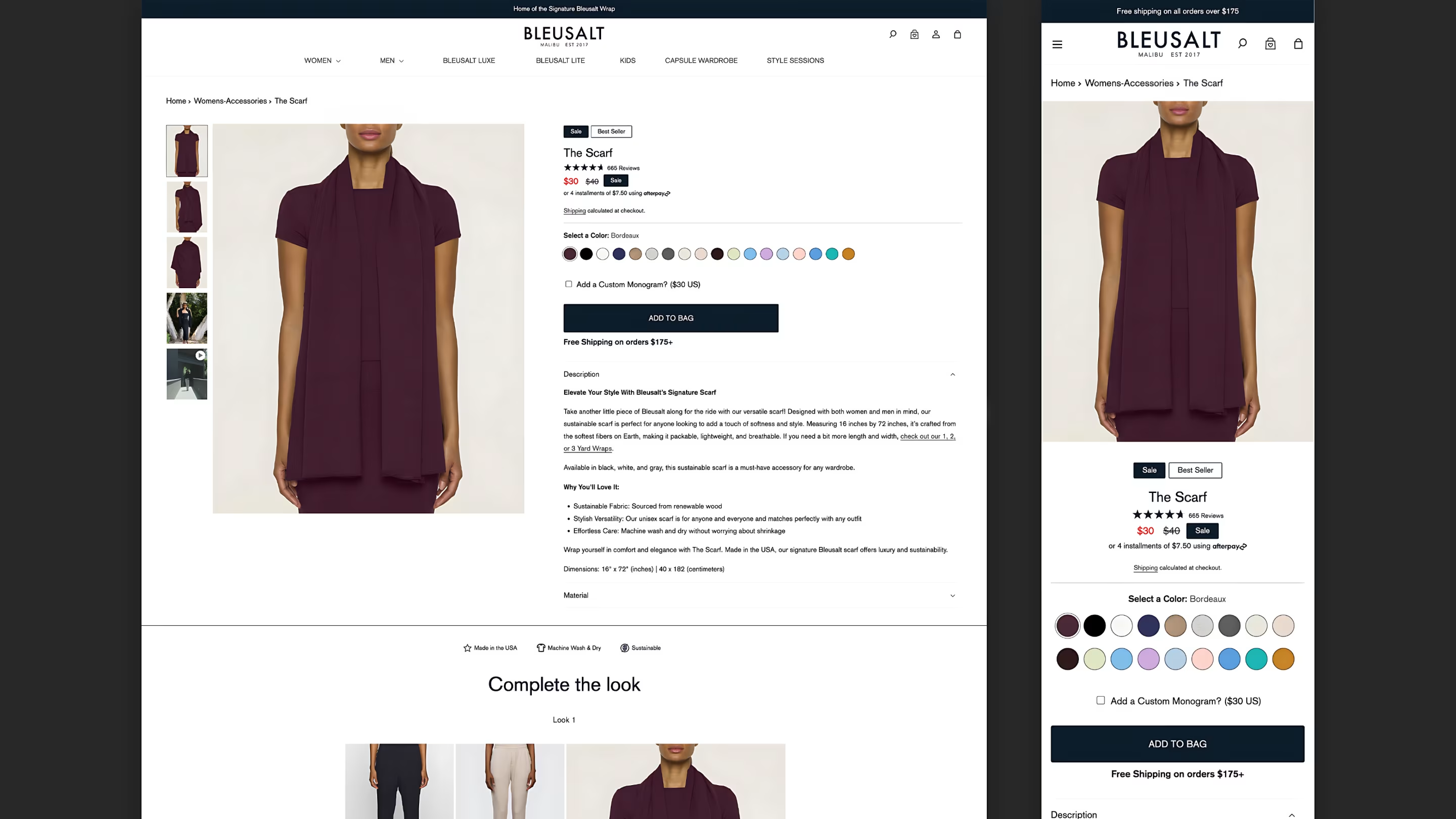
The PDP had to separate deciding from reading. I split the layout into a thumbnail gallery with video support on the left, a tight purchase column on the right — color swatches in a grid, monogram toggle, and a full-width Add to Bag — and pushed long-form copy into accordions below. Trust badges and a “Complete the look” module sit in their own rows so cross-sell never competes with the primary action.
Mobile exclusives 📱Direct link
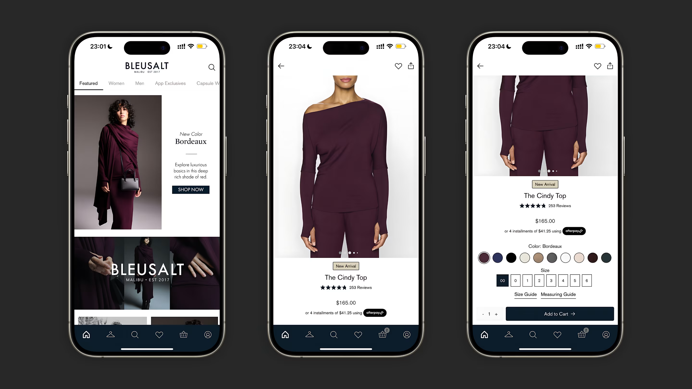
The app needed its own layout logic, not a shrunken website. I built a tabbed top nav for Featured, Women, Men, and App Exclusives, a five-icon bottom bar with cart badge, and a PDP with image carousel dots, inline ratings, and a size grid with guide links — all within thumb reach of a sticky Add to Cart bar.
From browse to bagDirect link
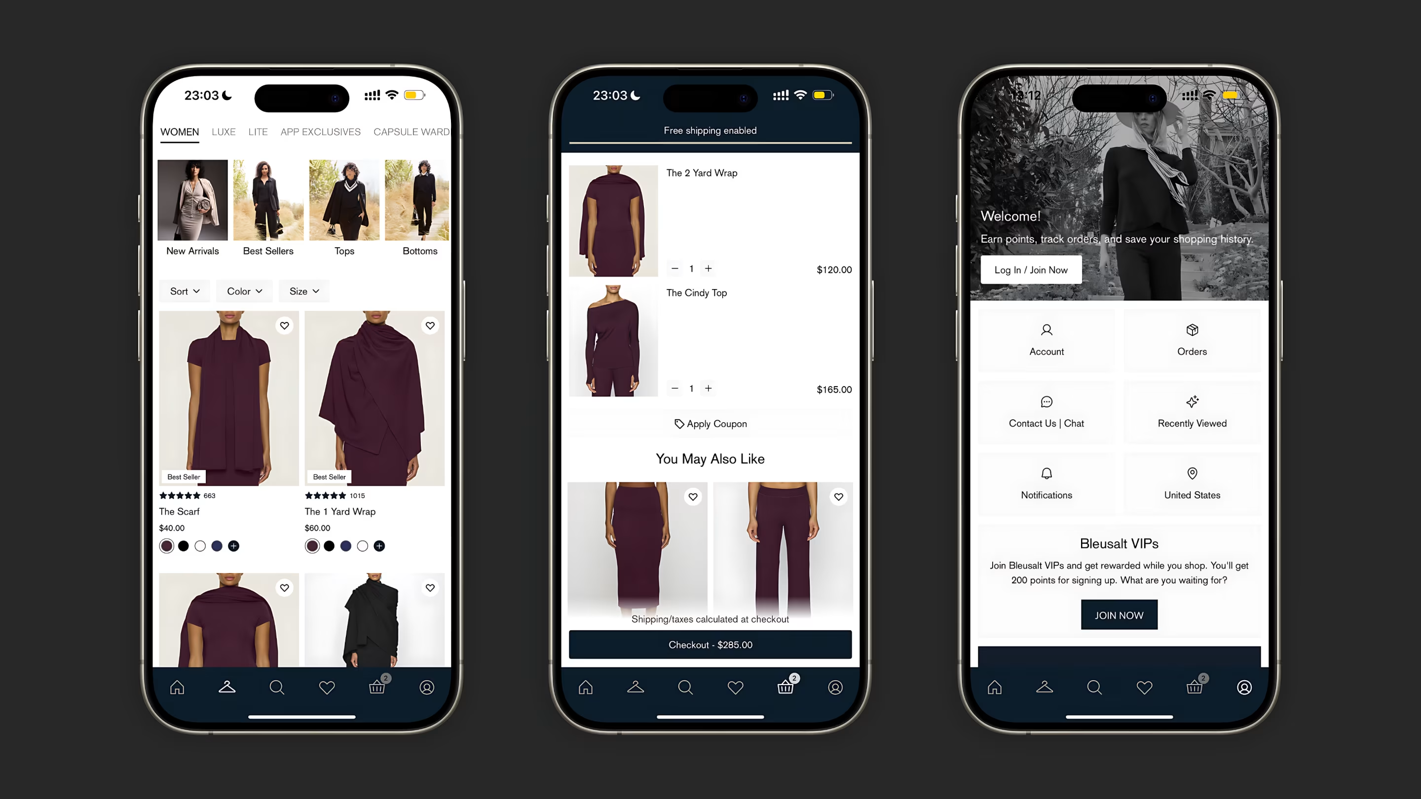
Discovery only matters if checkout follows. The product grid uses two-column cards with inline color swatches and heart actions, the cart shows quantity steppers with a running total and recommendation row, and the account screen groups orders, notifications, and VIP signup into a scannable icon grid — one visual system from browse to checkout.
What changedDirect link
Research and launch feedback validated the direction. The homepage read as editorial on both breakpoints. Product pages held attention without burying the purchase column. Mobile flows felt native to the app instead of a responsive afterthought.
Bleusalt’s interface finally matched the product — luxury e-commerce where layout and typography do as much work as the photography.
Behind the work
- Role
- Product Designer
- Company
- Bleusalt
- Services
- E-commerce Design, UX Design, UI Design, Brand Strategy, User Research
- Platforms
- Web, iOS
- Focus areas
- Responsive homepage, PDP layout, mobile navigation, cart UI, account and loyalty screens
- What I wanted to show you…
- Premium fashion UX is editorial first — the checkout is the last chapter, not the cover.
- What I learned…
- On luxury PDPs, keep the purchase column tight and push long copy below the fold — shoppers decide on imagery and options first.