Curated
Summary
Curated is an eCommerce platform that pairs online shopping with real human expertise — vetted gear experts guiding customers through high-consideration purchases. I helped reshape the experience so that voice shows up in discovery, comparison, and checkout — not as a sidebar, but as the spine of the journey.
Expert advice, generic checkoutDirect link
Anyone buying high-consideration gear knows the tension: you want a human who has been there, but most stores still feel like scrolling a warehouse. Curated had the experts. The experience hadn’t caught up.
Over several months I worked through customer interviews, expert feedback sessions, and journey mapping across discovery, comparison, and checkout. These weren’t impulse buys — cameras, skis, home studio kit — purchases that deserved time and clarity, not more catalogue noise.
What kept surfacing: shoppers valued expertise but couldn’t find it in the flow. Expert picks sat beside standard product tiles with no hierarchy. Comparison meant opening tabs and losing context. Checkout, built for speed, broke the momentum of a decision people had already spent days making.
The hypothesis that emerged was simple — guided commerce only works when the interface treats expert voice as native to the journey, not an add-on.
“Confidence before checkout.”
Every UX and visual decision followed from that. Expert recommendations became impossible to miss. Comparison tools kept context side by side. Checkout went mobile-first with trial terms spelled out upfront and one clear path to Secure checkout — designed for purchases that take time to get right, not abandon halfway through.

Finding the right gear 🧭Direct link
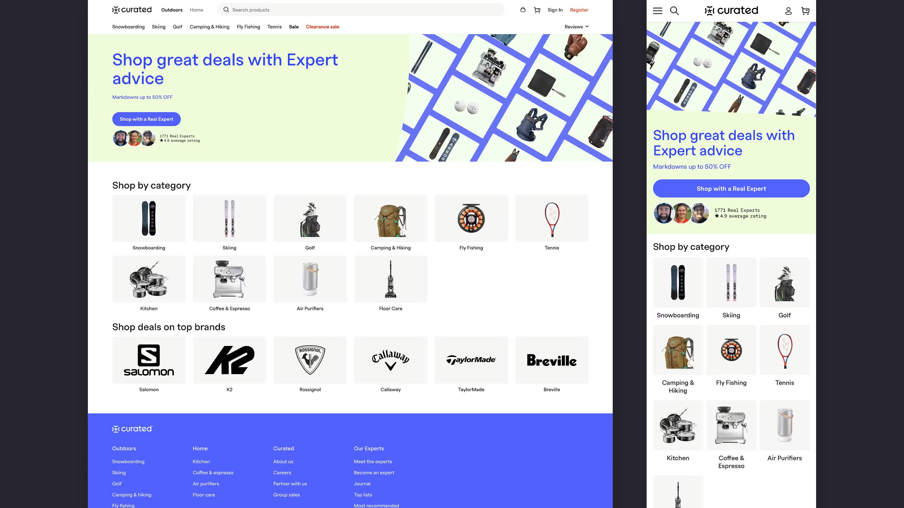
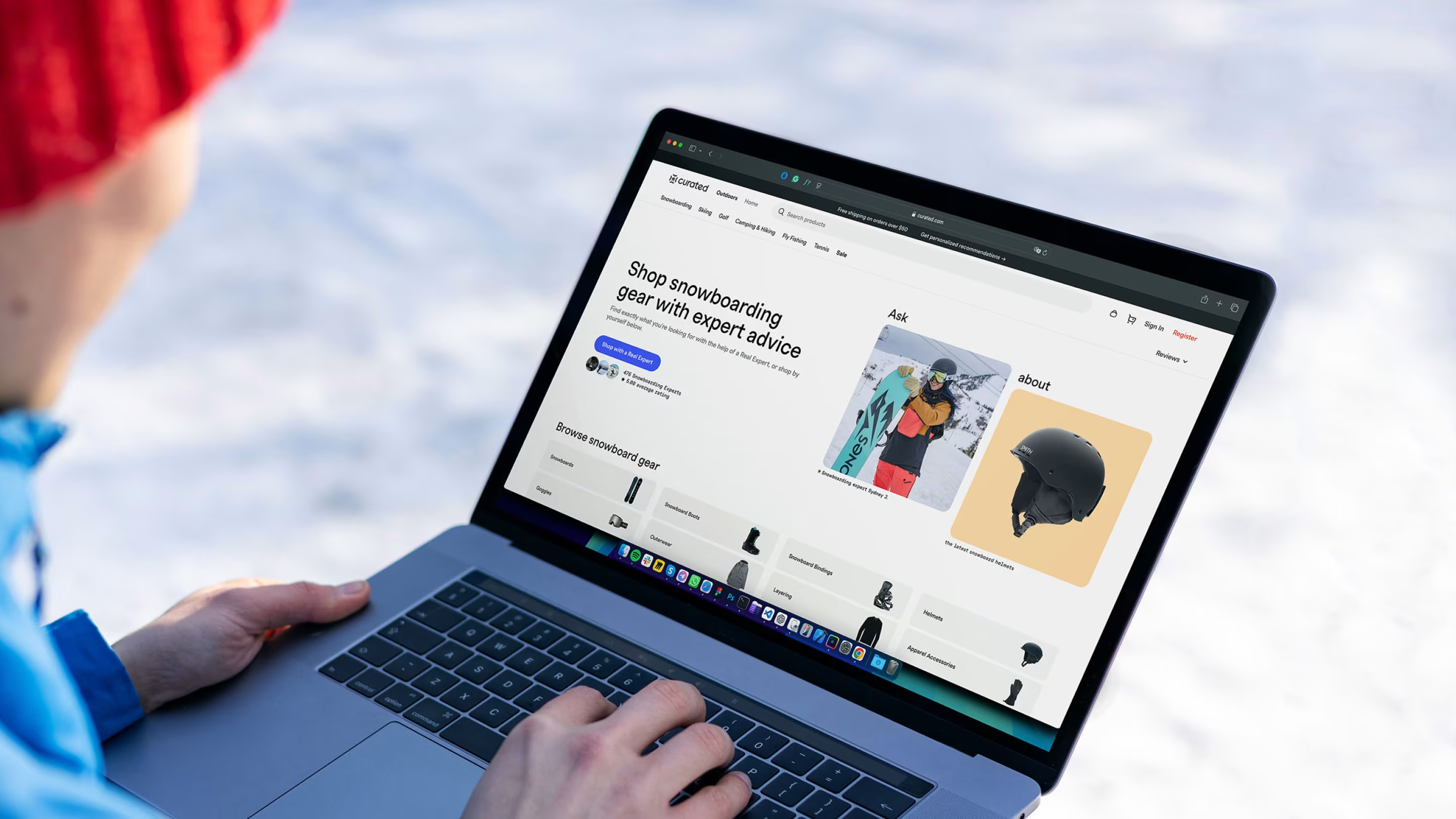
The first job was to make expertise visible from the first click. The homepage leads with real experts — profile faces, ratings, and a clear path to shop with someone who knows the category — instead of burying advice under product grids.
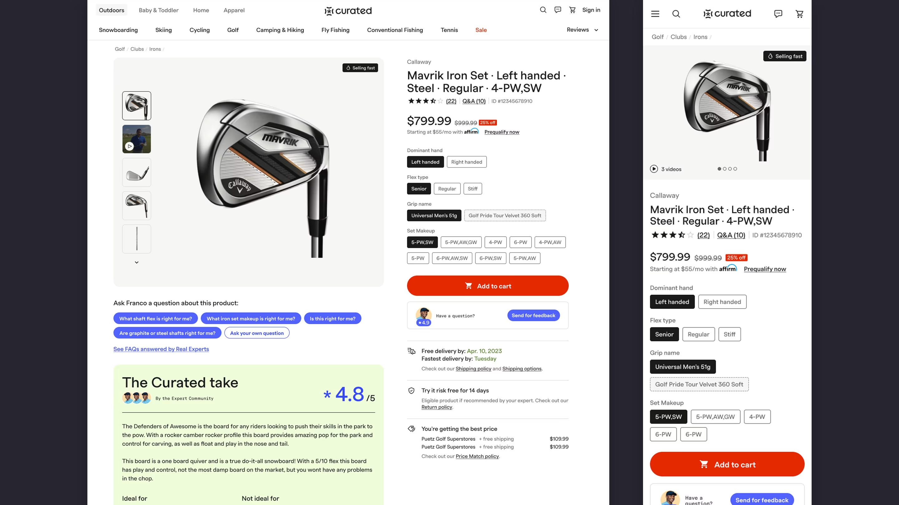
On product pages, I elevated vetted expert picks above standard tiles — name, photo, and a short “why this gear” note up front — with The Curated take review carrying the weight a spec sheet can’t.
Hear it from the people who use it 🎥Direct link
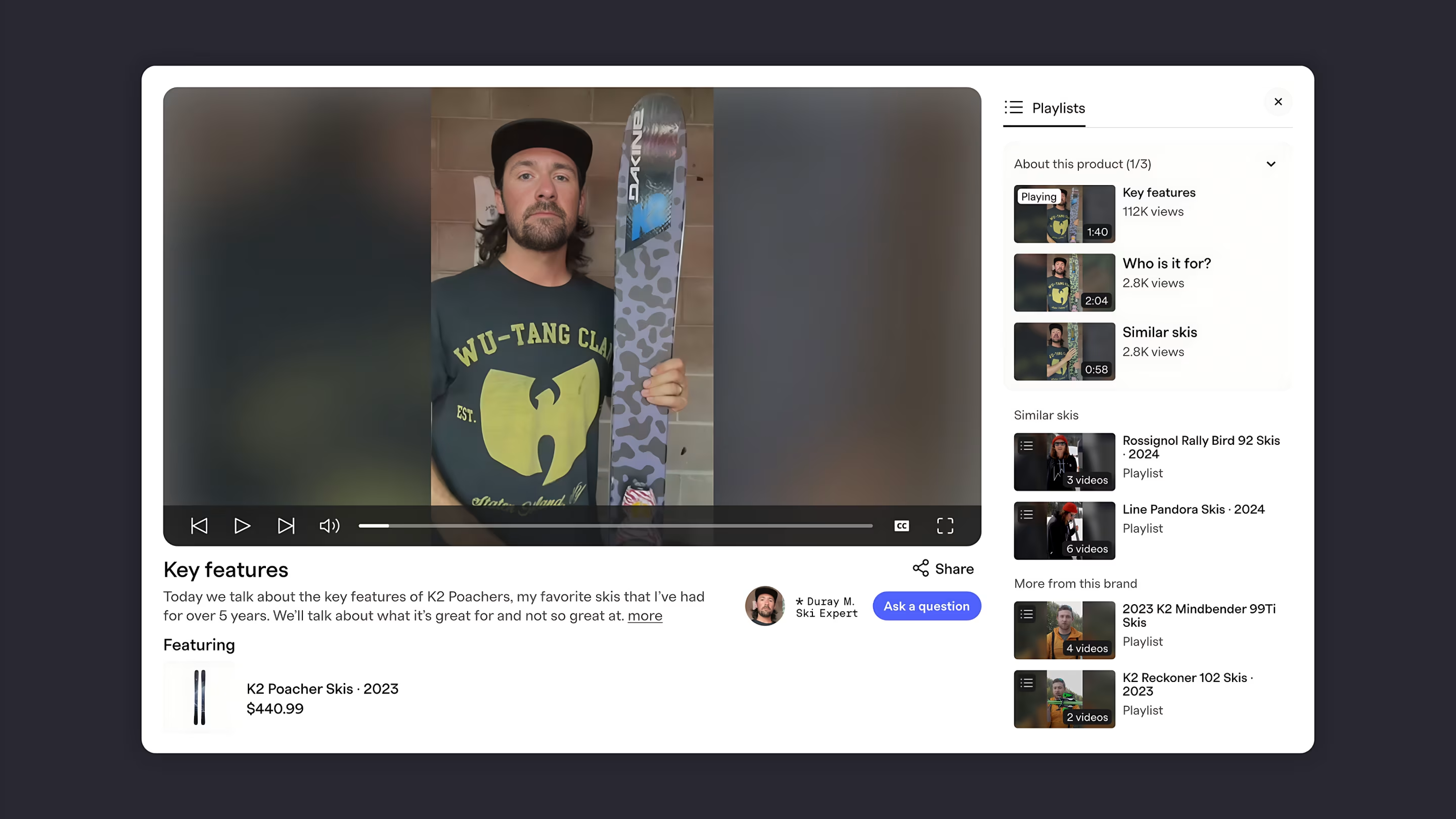
Expertise didn’t stop at copy. I designed video playlists where experts walk through key features, who a product is for, and alternatives — with the featured product linked beside every segment, so shoppers hear the story before they add to cart.
Compare with confidenceDirect link
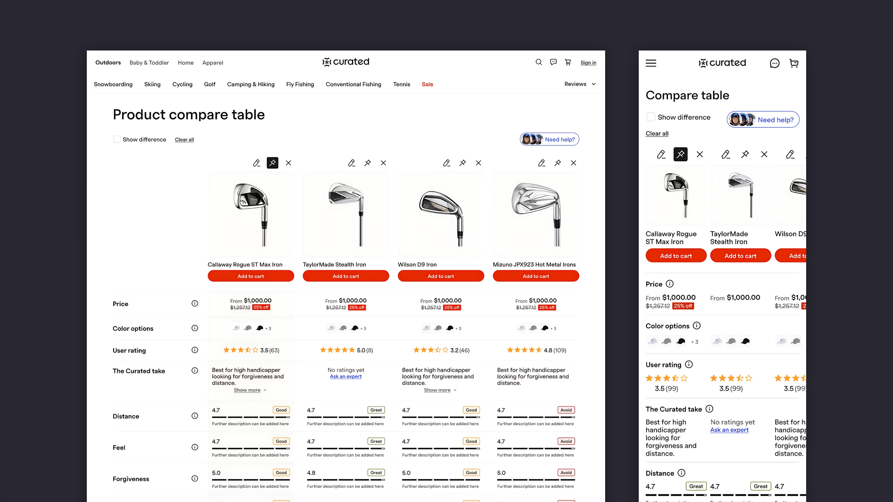
High-consideration purchases live or die at the comparison stage. I built a side-by-side view that keeps specs, expert notes, and price in one place — so shoppers could weigh options without opening tabs and losing the thread mid-decision.
One brand, two themes 🎨Direct link
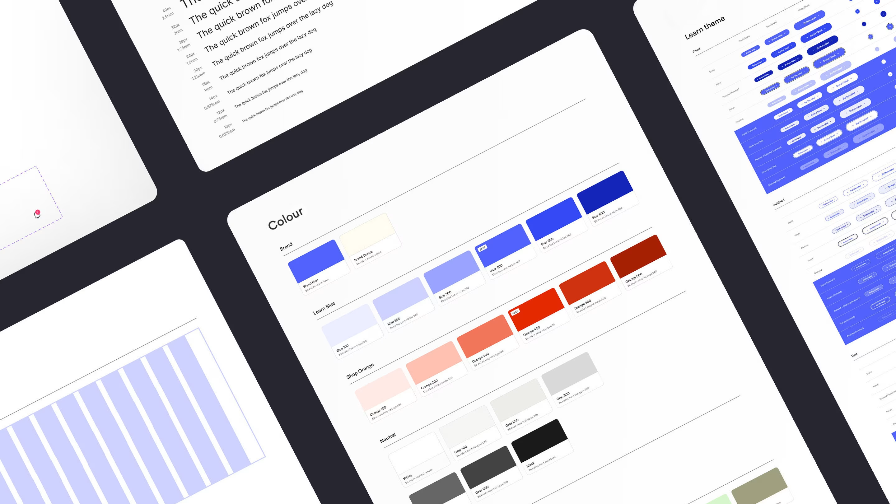
Learn and Shop run on different colour stories, but the experience had to feel like one Curated. I built a shared system — colour ramps, type scale, grid, and button states — so every page from homepage to compare table felt coherent.
Checkout that keeps paceDirect link
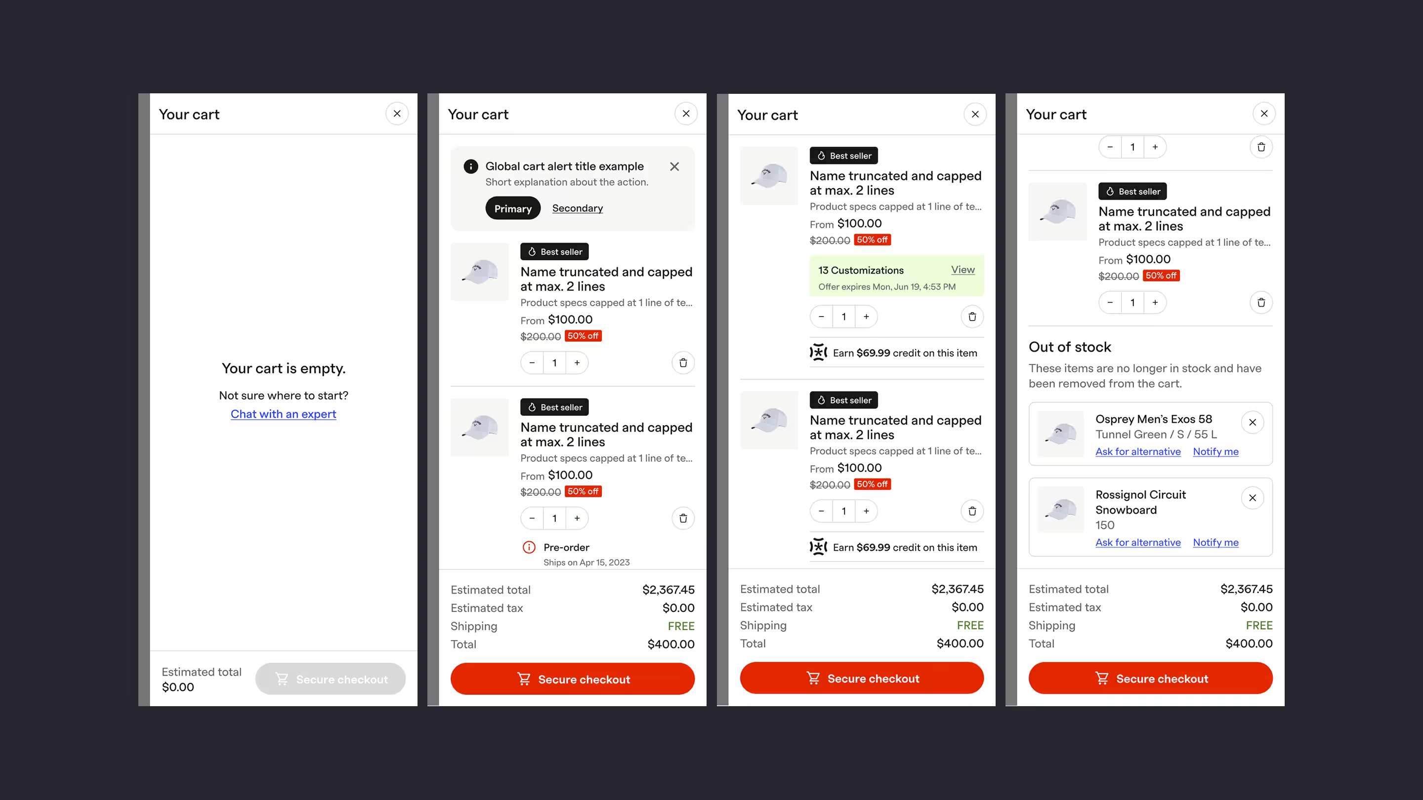
The cart had to work when it was empty, full, customized, or broken. I designed four sidebar states: an empty cart that routes shoppers to expert chat; active lines with global alerts, pre-order dates, and customization counts; earn-credit prompts on each item; and an out-of-stock block with ask-for-alternative and notify-me actions — all rolling up to one pricing summary and a single Secure checkout button.
What changedDirect link
Usability testing and iterative rollout feedback validated the direction. Expert picks carried real weight in the flow. Comparison stopped feeling like a detour. Checkout held momentum through to the final tap.
Curated moved closer to what it always promised — shopping with someone who knows the gear, not just selling it.
Behind the work
- Role
- UX/UI Designer
- Company
- Curated
- Services
- Prototyping, User Research, UX Design, UI Design, Design System
- Platforms
- Web, iOS
- Focus areas
- Expert recommendations, side-by-side comparison, trial cart & checkout, high-consideration purchase flows
- What I wanted to show you…
- Curated’s promise was human expertise — but the old flow buried it under catalogue tiles. This project was about making that voice impossible to miss from the first recommendation to the final tap.
- What I learned…
- High-consideration shoppers don’t need more options — they need better guidance at the moment they’re ready to decide. Expert picks, comparison, and checkout had to feel like one conversation, not three products stitched together.