Thinkers
Summary
Thinkers is an iOS notebook for creative professionals who need power without complexity. I led a complete redesign — extensive wireframe iteration and ML-powered organization for photos, scans, audio, and video.
Power without the learning curveDirect link
Creative professionals live in their notes app — but the previous Thinkers buried ideas behind a confusing interface and limited capture. People wanted capability without the overhead of a full productivity suite.
Over several months I worked through user interviews, competitive analysis, and extensive wireframe iteration — more than a hundred screens exploring folder structure, onboarding, and capture flows. The sweet spot kept appearing between bare notes apps and overwhelming power-user tools.
What kept surfacing: ideas arrive messy — photos, voice memos, scans, video — and organizing them later is a tax nobody pays willingly. Machine learning could help, but only if the interface felt familiar on day one. The hypothesis that emerged was that a notebook earns loyalty when capture is instant and structure grows with you, not ahead of you.
“Familiar on day one. Capable on day one hundred.”
Every UX and visual decision followed from that. I redesigned folder hierarchy, progressive onboarding, and unified media capture so ML-assisted tagging reduced the organizing burden. Commenting and team feedback stayed close to the content without turning a personal notebook into enterprise software.
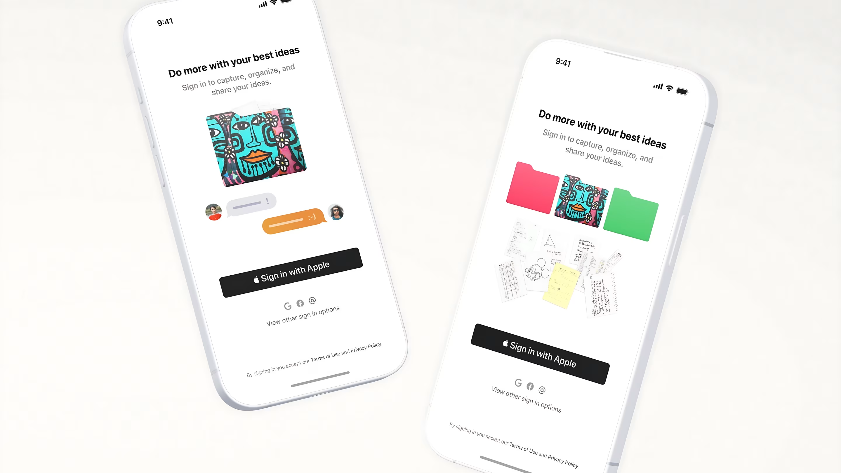
Familiar on day one 📁Direct link
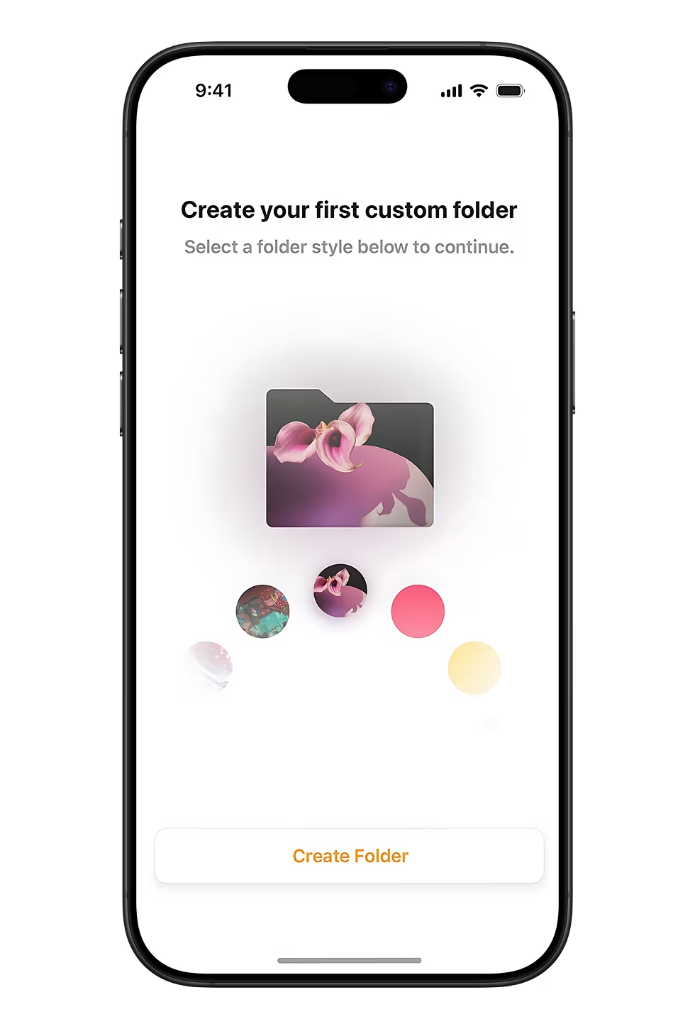
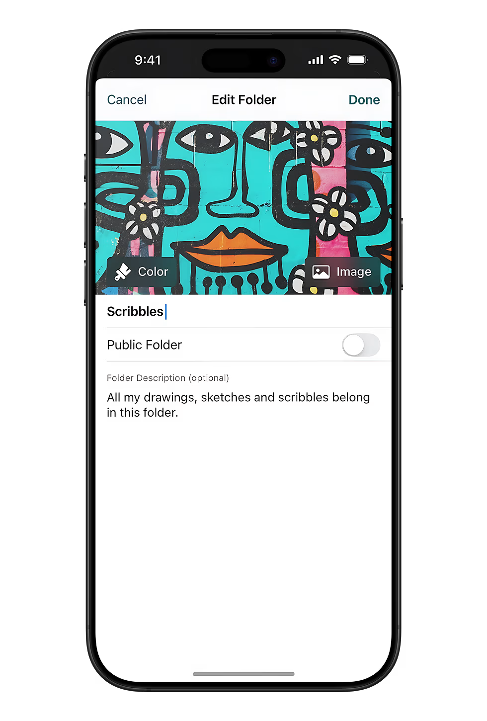
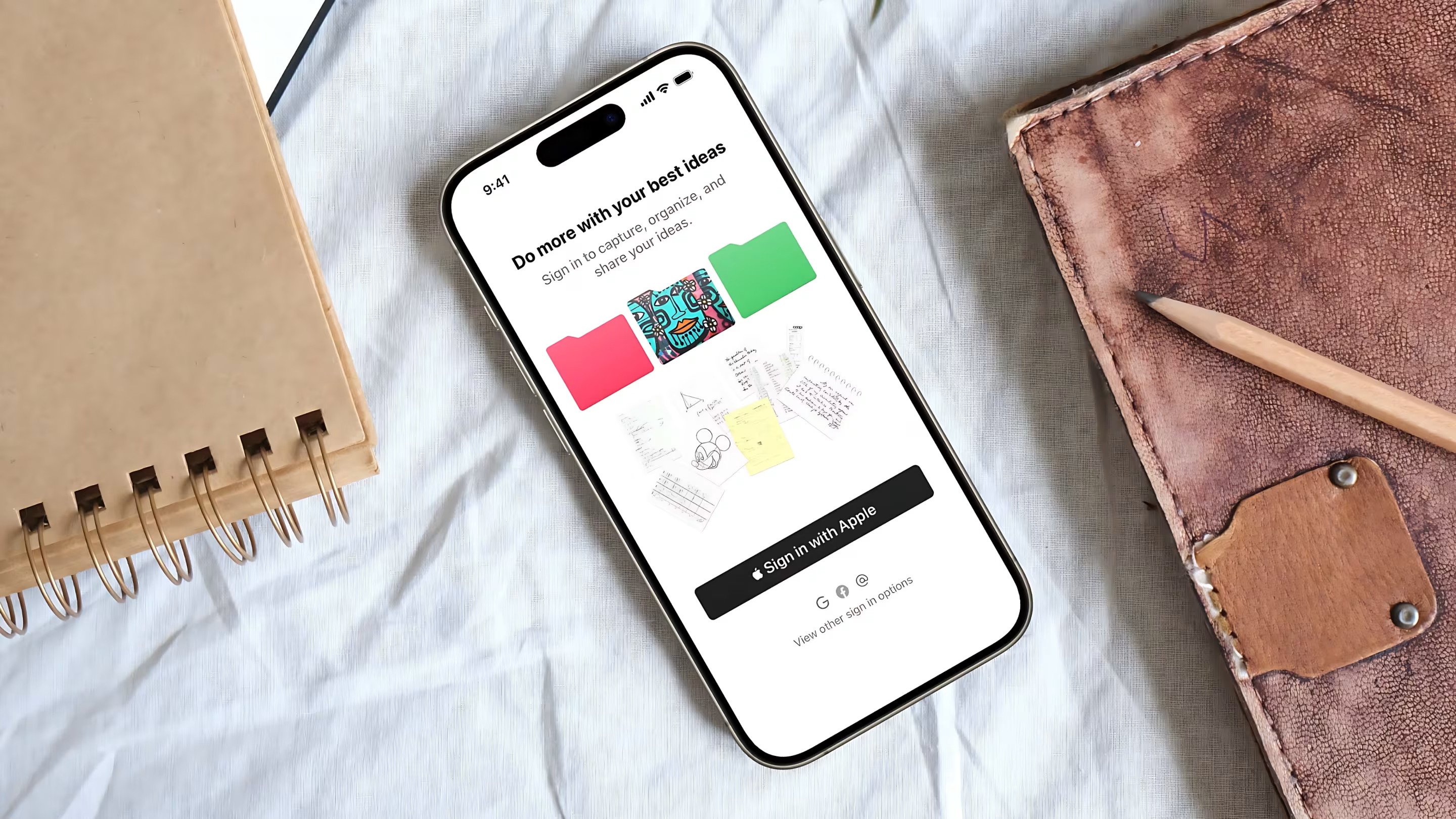
Power features only help if they don’t bury new users. Onboarding walks you through your first custom folder — pick a cover style and land in a home screen that already makes sense.
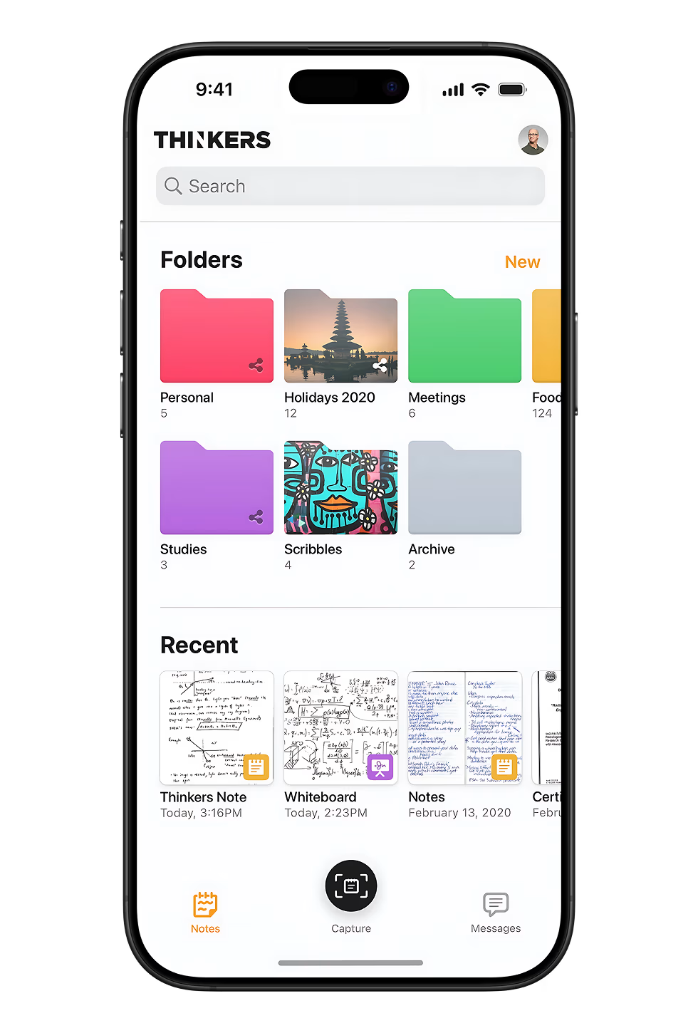
Structure that scalesDirect link
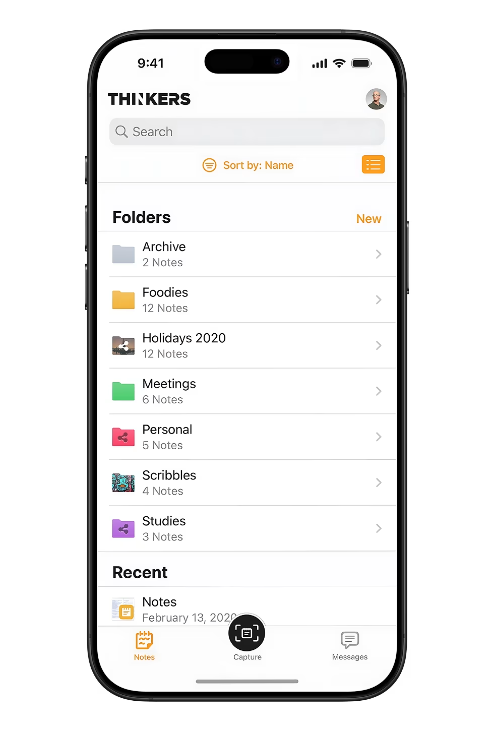
I redesigned the folder hierarchy to work in grid or list view — sort by name, scan at a glance, drill in when you need to. Custom covers, descriptions, and sharing settings keep each folder feeling personal without turning organization into a chore.
Capture everything 📎Direct link
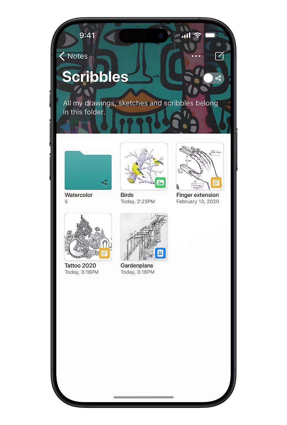
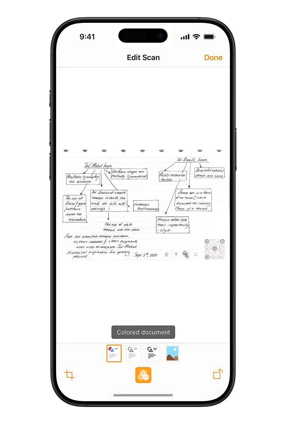
Ideas arrive messy — photos, scans, sketches, and handwritten notes in one notebook model. I unified capture types inside folders like Scribbles and built scan editing with filter controls so document capture feels as natural as snapping a photo.
Comment where it matters 💬Direct link
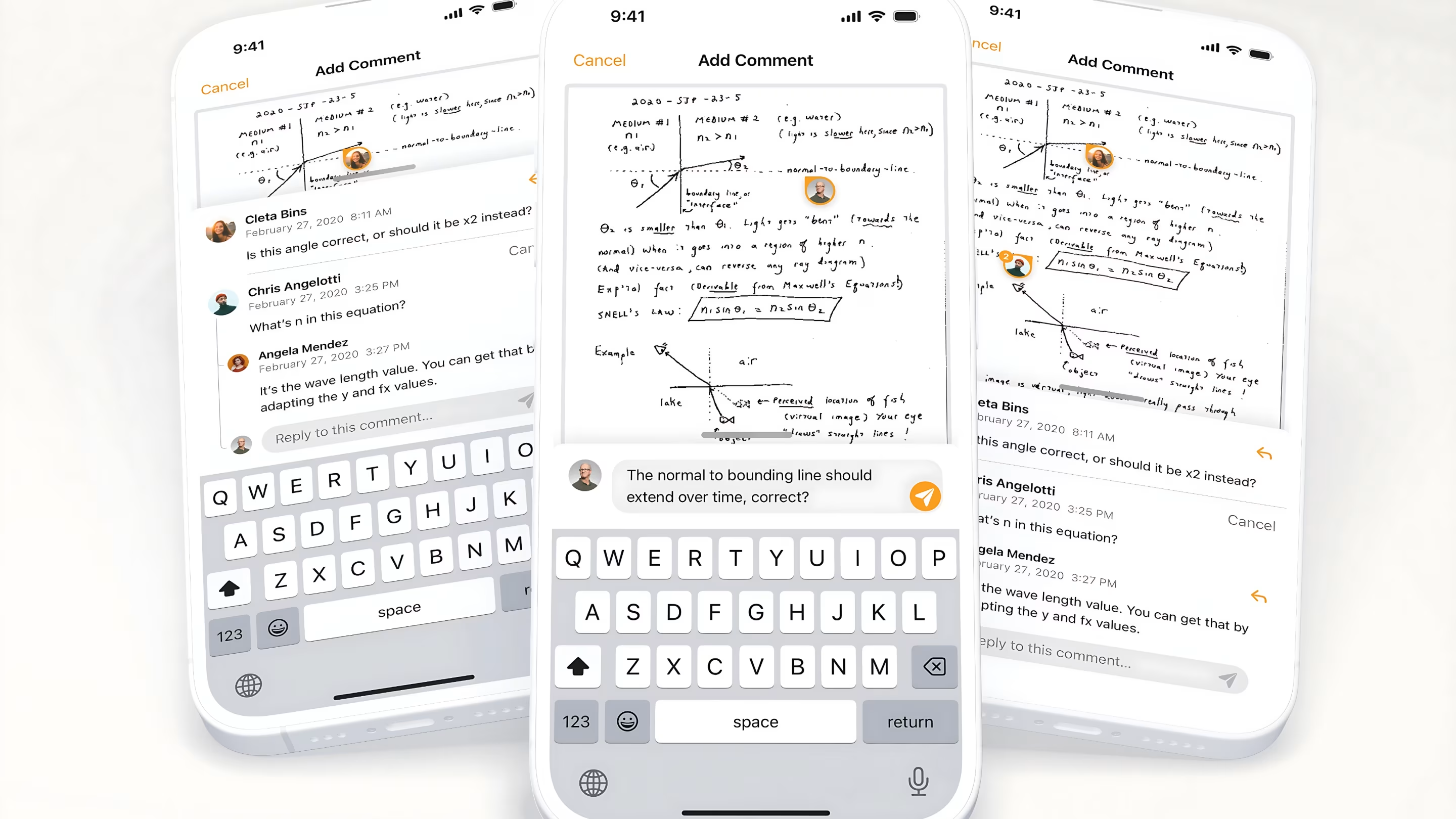
Team feedback stayed close to the content without turning a personal notebook into enterprise software. Pin comments directly on scans and notes — so questions land on the sketch, not in a separate thread.
What changedDirect link
Research and launch feedback validated the direction. Users described the experience as intuitive where the old app had felt opaque. Multi-media capture went from niche to everyday. The redesign landed the balance people had been asking for — enough power to keep creative professionals, without the complexity that pushed them away.
Thinkers became the notebook people actually kept open — not the one they migrated away from after a week.
Behind the work
- Role
- Product Designer
- Company
- Thinkers
- Services
- Mobile App Design, iOS Interface Design, UX Design, Motion Graphics, Prototyping
- Platforms
- iOS
- Focus areas
- Onboarding, folder hierarchy, multi-media capture, scan editing, pinned comments
- What I wanted to show you…
- Note apps live or die on the gap between first capture and first successful find.
- What I learned…
- Thorough wireframe exploration across every media state prevented confusion in production — what looked excessive upfront saved rework later.