Visa Member Benefits
Summary
Visa provides cardholder benefits including price protection, extended warranty, and return protection. I redesigned the member benefits experience for mobile-first access, WCAG 2.1 AA compliance, and clearer task completion.
Benefits nobody could findDirect link
Cardholder benefits only matter if people can actually reach them — on mobile, under stress, often when something has already gone wrong. Visa had the coverage. The experience made simple lookups feel like a scavenger hunt.
Over several months I worked through user feedback analysis, analytics review, and stakeholder interviews across the member benefits journey. People weren’t struggling with the benefits themselves — they were struggling to find forms, understand eligibility, and complete tasks on the device they actually had in hand.
What kept surfacing: poor mobile responsiveness, accessibility gaps, and navigation layers that turned a straightforward claim into a multi-tab ordeal. For an institution built on trust, every friction point read as indifference. The hypothesis that emerged was that inclusive, clear design isn’t a nice-to-have — it’s how trustworthy institutions should behave online.
“Fewer layers beat clever interactions.”
Every UX and visual decision followed from that. Keyboard navigation, screen reader compatibility, and contrast ratios were designed in from the start. Paths to forms, support, and critical information were simplified with a clean aesthetic aligned to Visa’s brand — mobile-first, WCAG 2.1 Level AA throughout.
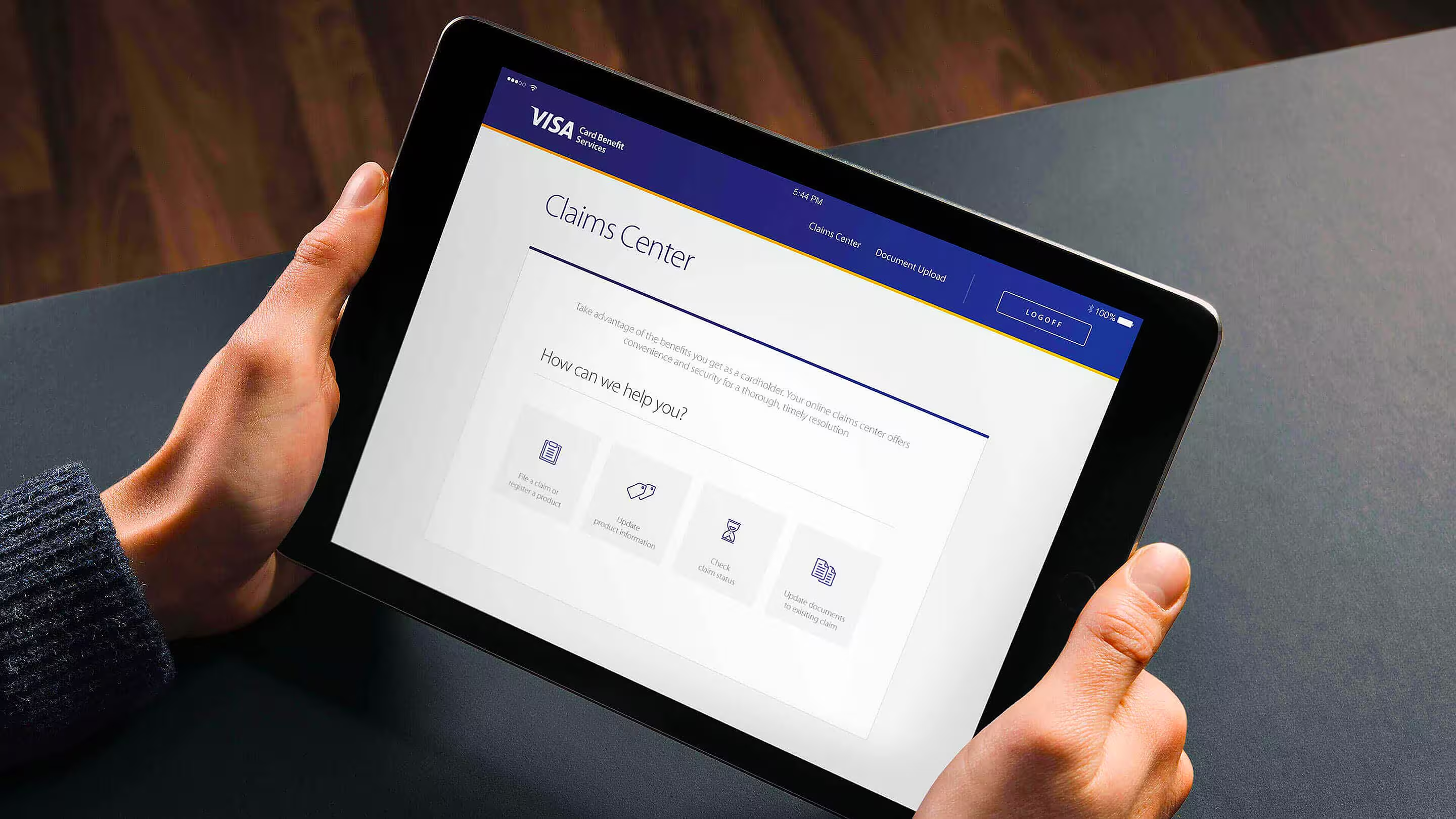
Eligibility without guessworkDirect link
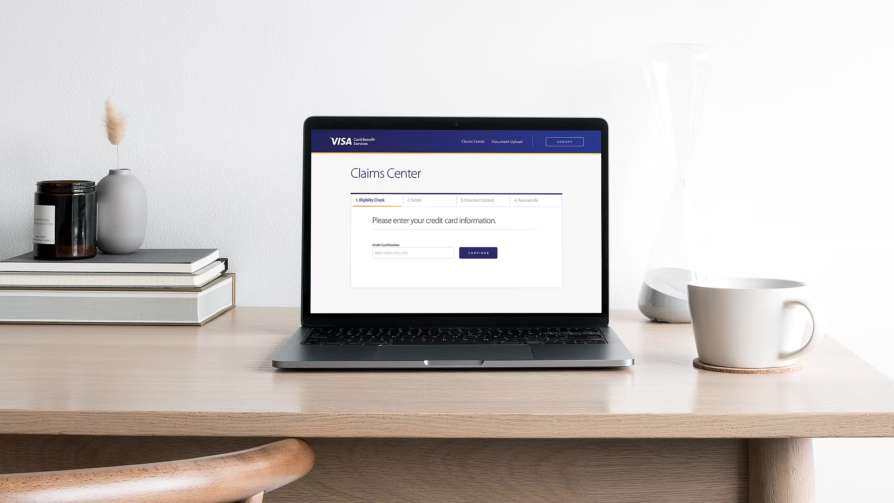
Starting a claim had to feel guided, not like a scavenger hunt. I redesigned the flow with a visible stepper — Eligibility, Details, Document Upload, Personal Info — and stripped the first step down to what mattered: confirm your card and continue.
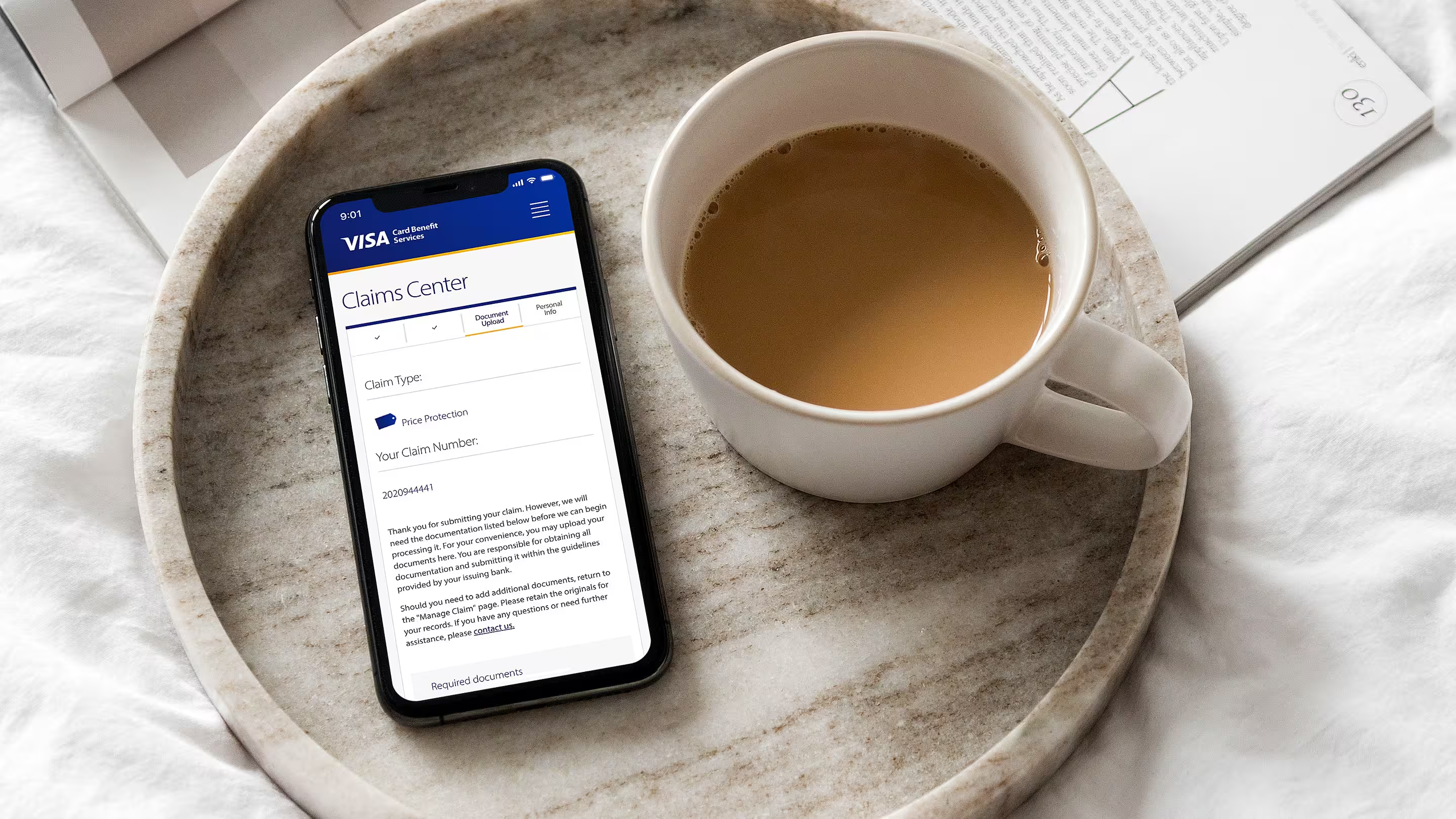
Mobile-first clarity 📱Direct link
Most benefit journeys start on a phone. The document upload step shows claim type, claim number, and required documents in one scroll — so cardholders know exactly what to submit without switching tabs or hunting for fine print.
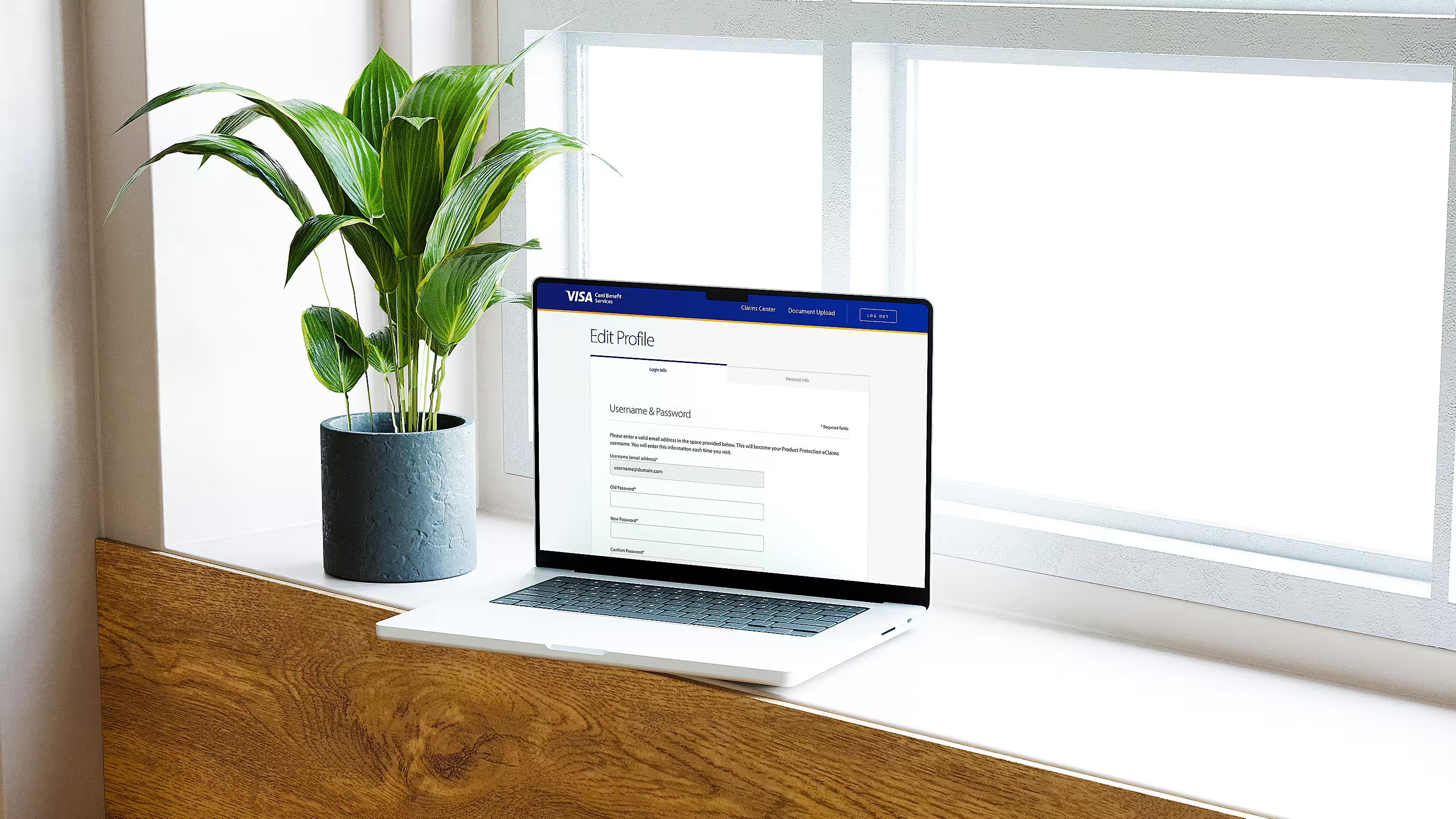
Account you can manageDirect link
Profile and login settings needed the same clarity as the claim flow. I structured Edit Profile with tabbed Login Info and Personal Info, plain labels, and form fields that work with keyboard navigation and screen readers — not an afterthought buried in settings.
What changedDirect link
Research and launch feedback validated the direction. Locating forms and completing key benefit flows felt straightforward on mobile for the first time. Navigation layers came down. WCAG compliance meant the experience worked for everyone, not just the default user the old site had been designed around.
Member benefits became something cardholders could actually use — not a fine-print promise buried behind friction.
Behind the work
- Role
- UX/UI Designer
- Company
- Visa
- Services
- Prototyping, UX Design, UI Design, User Research, Accessibility
- Platforms
- Web
- Focus areas
- Claims hub, eligibility flow, mobile document upload, profile management, WCAG 2.1 AA
- What I wanted to show you…
- Inclusive design isn’t a checklist — it’s how trustworthy institutions should behave online.
- What I learned…
- When stakes are compliance and clarity, fewer navigation layers beat clever interactions every time.